I looked up a few of the artist’s names which I wrote down from the Affordable Art Fair. The ones who stood out the most to me in relation to my own work, were: Clay Sinclair, Ros Rixon and Joseph Loughborough.
Clay Sinclair’s work is usually done using acrylic on Perspex. The colours are really bright, and the work reminded me of my own because of the use of type as the main feature within the pieces. The few which stand out to me are ‘Judge Me’, ‘Winners and Losers’ and ‘Massage My Ego’.

The piece, ‘Judge Me’ says ‘judge me by my…’ and then goes on to have many words within the piece, such as ‘religion’, ‘status’, ‘happiness’, ‘talent’ and ‘success’. I could use this within my own work and maybe have something such as ‘don’t bully me because of my… looks, ethnicity, weight, height, voice, intelligence’ etc. I feel that this could produce a fairly strong impact, but maybe the message given wouldn’t be long lasting, and the way in which I presented this would really affect how it would be received.
 In the piece ‘Winners and Losers’ I like how each letter, etc, is presented differently. This shows the many different ways in which to use type within work and how each one gives a different effect. If I were to do something similar to this within my own pieces, I think that it would be better to only select a few individual styles to repeat and to produce them with different materials to make them stand out more. However, I do think that this would be quite effective. I also like how you have to look quite hard to see certain words in the piece (eg: the word ‘pain’ on the right-hand side).
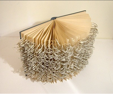
I was really attracted to Ros Rixon’s work at the fair. She uses text and paper to create 3D pieces. One piece ‘Every New Thought’ has many different rings of paper all linked together, which really stands out. I like the idea of maybe doing something similar to this, but using either people’s bullying stories, or words relating to bullying (such as the names which the victim may be called, of the feelings they may feel, or even how the bully may feel in order for them to bully others). I could then take photos of these pieces and use them within my work.


Joseph Loughborough’s work is really eye-catching and really captures emotion. For example, in the piece ‘The Enemy’, the person seems trapped and confused, just by the use of marks made. The different tones of grey help to make it interesting but not too bold and I think that this piece without the use of colour works well. When developing my ideas, I will consider the emotive effect of these pieces and maybe work in a similar way to show the emotions of the characters within my work.

Target for today: A Look up artists written down from the Affordable Art Fair and consider how their work may influences and inspire my own.
Target for tomorrow: Prepare more sketchbook pages and continue researching artists from the Affordable Art Fair.
No comments:
Post a Comment