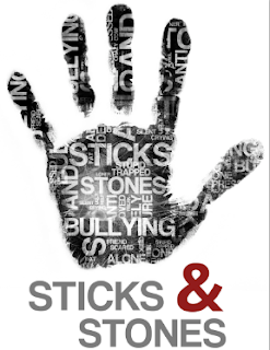
Today I created the handprint logo idea which I had sketched out in my sketchbook. When I created my digital poster designs I made a temporary logo design to use on the designs. However, this didn’t turn out how I wanted it to and so I designed it properly today. The main issue before was that I had created it as if it were a left hand in the stop position, when a right hand would’ve been more visually appealing on, for example, letterheads, etc. Also, I had made the name ‘Sticks and Stones’ integrated within the palm of the hand and this made it quite hard to read and so I had to think of a new way to present the name of the company as part of the handprint image.
 To create the logo, I used a program/website online called ‘Wordle’ where you enter lots of words (and repeat the words that you want to come up bigger than the others), and then you can create alternative ways to display these. This was also useful because this was how I discovered the font ‘Coolvetica’, which I really like and think works well on my posters. I then took these words (such as ‘bullying’, ‘alone’ and ‘depressed’) and copied them into Photoshop and rearranged them and rotated them, etc, to create a nice selection of words. I then got an image of a handprint and made changes so that the words were only inside the handprint. I then made a few edits to the overall image. I think that this is really effective and although it’s quite hard to read, this isn’t too much of an issue, as it’s more the effect which I was trying to achieve. I then thought that perhaps I should use my own handprint and so I tried this as well, but this didn’t look as good as the original so I may just leave it how it is or try to create another print of my hand which may look better. I then experimented with where to place the type and decided on at the bottom as I felt that this balanced out the hand nicely. I really like this logo design, and feel that I have achieved the look that I wanted which I had not yet gotten close to in my previous designs. I will ask for opinions of this logo to see what others think of it.
I then created a few letterhead and business card designs to see how the logo would work with these. I still like the crossover of the thin lines at the top and down the side, but perhaps the logo works best at the bottom of the page. For the business cards, I quite like the black design with the white writing. I also like how the logo is able to be larger on these and so is easier to see. Perhaps I could also try making a double side design with the logo on one side and the information on the other side. Again I will ask for opinions on these. I will also need to start thinking about how and what to print the letterheads and business cards onto.
Target for today: Create handprint logo idea digitally and letterhead and business card ideas to go with this.
Target for tomorrow: Talk about work so far with peers to hear their opinions and update sketchbook with digital designs, etc.


No comments:
Post a Comment